ggplot2: geom_histogram & facet_wrap with different vertical lines on each facet

The geom_histogram() function from ggplot2 package is used to create a histogram plot. For example, let’s plot the distribution of Sepal.Length from iris data.
library(ggplot2)
theme_set(theme_bw())
ggplot(iris, aes(Sepal.Length)) + geom_histogram(fill = "orange")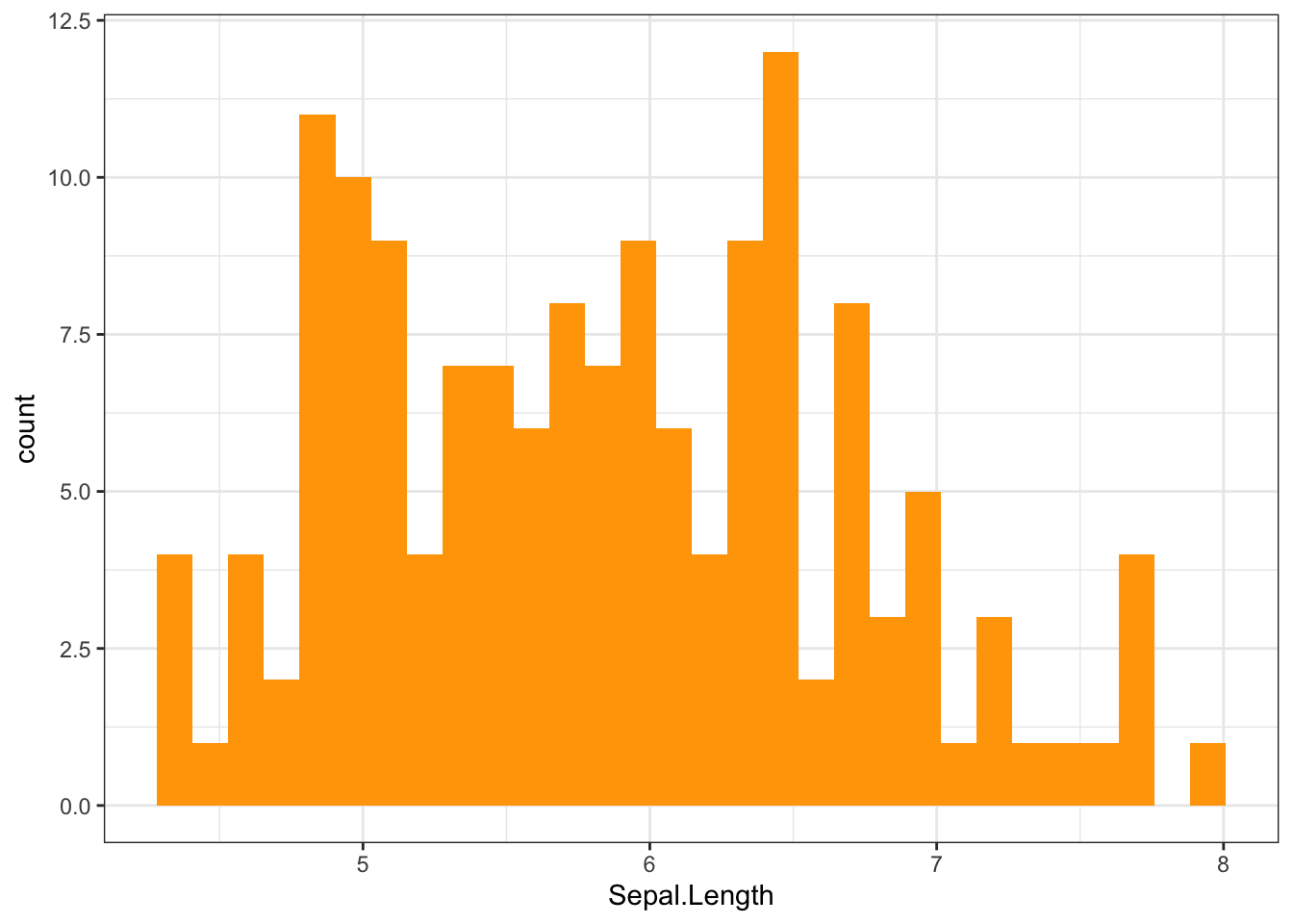
To add a vertical line to show the mean value of Sepal.Length, we can use geom_vline().
library(ggplot2)
ggplot(iris, aes(Sepal.Length)) + geom_histogram(fill = "orange") +
  geom_vline(data = iris, aes(xintercept = mean(Sepal.Length)))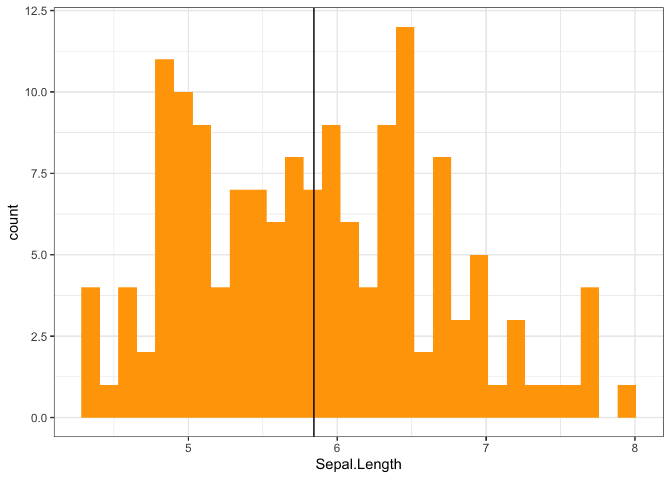
One of the most powerful aspects of ggplot2 is the ease with which you can create multiple sub-plots using facet_wrap(). For example, let’s plot the distribution of Sepal.Length by each group of Species from iris data.
ggplot(iris, aes(Sepal.Length)) + geom_histogram(fill = "orange") +
  facet_wrap(~Species) +
  geom_vline(data = iris, aes(xintercept = mean(Sepal.Length)))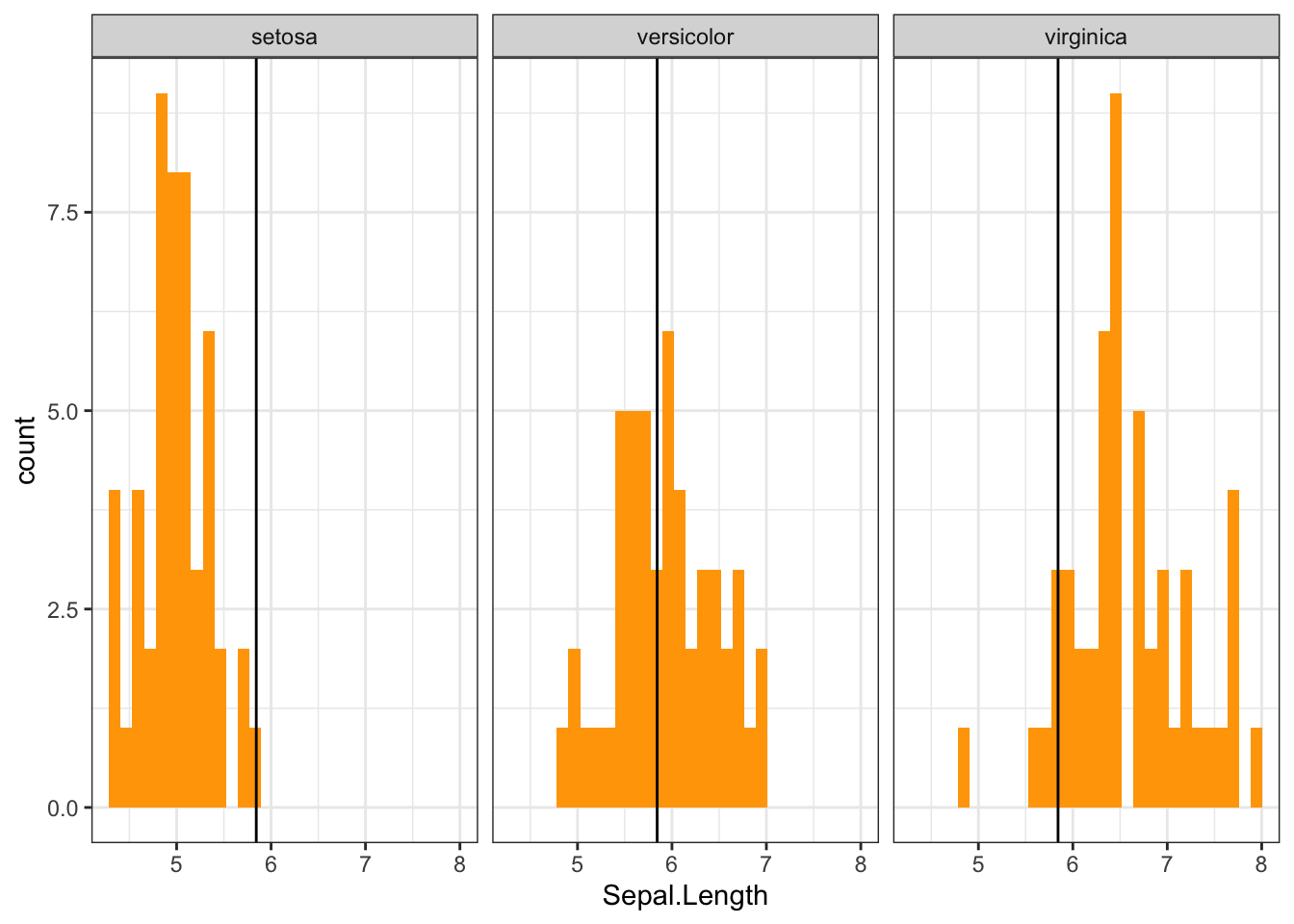
While using facet_wrap() each plot shows a different subset of the data, however, the geom_vline() adds the vertical line on the same x-intercept in all plots. For instance, in the above histograms the vertical line shows the overall mean of Sepal.Length column instead of mean of each group.
It’s more practical to add a vertical line on each facet showing the mean for each group of data. To do so, a separate data frame containing the mean of each group should be created to use with geom_vline().
library(dplyr)## Warning: package 'dplyr' was built under R version 4.0.5vline <- summarise(group_by(iris,Species), mean = mean(Sepal.Length))
vline## # A tibble: 3 × 2
## Species mean
## <fct> <dbl>
## 1 setosa 5.01
## 2 versicolor 5.94
## 3 virginica 6.59ggplot(iris, aes(Sepal.Length)) + geom_histogram(fill = "orange") +
facet_wrap(~Species) +
geom_vline(data = vline, aes(xintercept = mean))